Bringing an Autumn Vibe to Your Dining and Kitchen Spaces

If you're looking for fall decorating ideas or inspiration, you're in the right place!
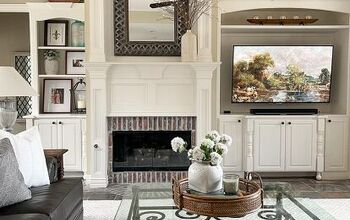
In my last two videos, I first started by decorating the front hall entry console in three different ways. Then I chose one look and used it as inspiration to bring that autumn feel to my sitting area.
Today, I’m focusing on the dining area and kitchen to bring that autumn vibe into these spaces. I’ll be using a lot of my existing décor, tweaking it just a bit to make it season-appropriate.
So, let’s jump right into it and start decorating!
Table of contents
- The Current Dining Area Setup
- Adding Warmth to the Seating Alcove
- Modifying Artwork for a Seasonal Touch
- Switching Out Greenery for Lanterns
- Dressing Up the Dining Table
- Creating a Vase Arrangement
- Styling the Countertop as a Serving Area
- Hiding the Power Outlet
- Styling the Other Counter Corner
- Styling Practical Counter Spaces
- Keeping the Kitchen Island Functional
- The Overall Look
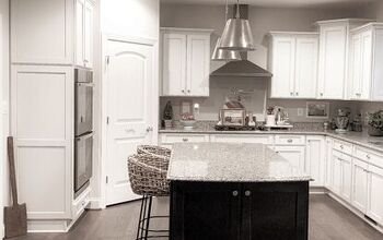
The Current Dining Area Setup
This is how I had the dining area styled during the warmer months. As you can see, I prefer versatile neutral colors with a touch of black for some contrast and interest. I’ve lived with this look for a while now, but I’ve been wanting to dress up the seating alcove a bit more. And what better opportunity than autumn to make some updates and cozy it up?

During this time of year, I’m inspired by the essence of the season—how the light changes in autumn and nature takes on a soft, moody appearance. So, you won’t see pumpkins or too many bright colors in my styling.

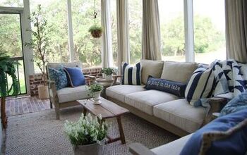
Adding Warmth to the Seating Alcove
In the seating alcove, which is next to the dining and kitchen space, I decided to start from the top down. First, I installed bamboo Roman shades in a soft, muted color that complements my floors. They also create balance by mimicking the muted dark cabinet color that’s directly opposite.

To add coziness, I replaced the pillow covers with darker, heavier textured fabrics.

This dark brown “B” pillow adds some drama to the space without being overpowering, while the dark taupe chenille ties in other color tones in the room. I also added a pale taupe teddy-style pillow for that extra soft, cozy element.

I mirrored the pillow arrangement on the other side of the bench seating.

You may notice that I’m using a couple of the same pillow colors as I did in the living room. Since this is an open-plan space, I wanted to keep a consistent color and texture thread moving from one area to the other.
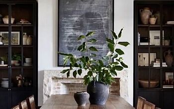
Modifying Artwork for a Seasonal Touch
Next, I addressed the walls on either side of the seating alcove. To make an even bigger impact in cozying up this area, I took it a step further by modifying my artwork. These metal frames are from Target and are very easy to take apart.
I had Hobby Lobby’s framing department cut darker-colored mats quite inexpensively and placed the new ones directly over the existing mats.

This way, I can easily switch back to white mats later if I want to. You can really see what a difference just changing out the mat makes!

Switching Out Greenery for Lanterns
I also moved the plants to another room and brought in a couple of lanterns with warm, glowing candles.

These are lanterns I usually use during the Christmas season, but I added some dried pecans and organic bowl filler for that fall-inspired look.

Dressing Up the Dining Table
Now let’s move on to the dining table. To soften the hard look of the table, I laid down a runner that complements the neutral colors in the space.

The light color breaks up the harshness of the black table and allows me to use dark accent pieces on top, making them stand out.

Because there’s a chandelier centered above the table, I placed the vase off-centered and to the side to balance the look. I then brought in a large textured bowl with a mixture of earthy-colored bowl filler for that organic element.

Some of these are from Target, and others are from the At Home store. I separated them into light and dark colors, using different ones depending on the season. The bowl is from Target’s Hearth and Hand collection from a few years ago, so I’m not sure if it’s still available.

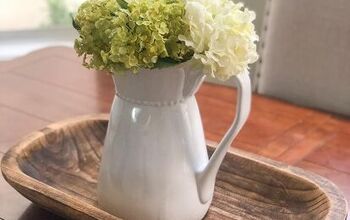
Creating a Vase Arrangement
Now, let’s put together an easy vase arrangement. As I mentioned in my fall living room decorating video, in an open-plan space, try to use similar color tones in your stems and floral arrangements for a cohesive look. So, I’m using the same muted-colored grass I used in my entry console as a base.

To mimic the beige and taupe colors of the flowers from the console arrangement, I’m using seed cluster stems in a similar color.

I’m using three grass stems and four seed cluster stems. I’ll just play around with them—bending, fluffing, and intertwining them—until I’m happy with how it looks.

Styling the Countertop as a Serving Area
Next, I’ll style the long countertop that sits next to the dining table, which also acts as a serving area when we have guests. I like to keep it simple and stylish, so here’s my tried-and-true styling method. Think of it as a good recipe—once you get it right, you can repeat it over and over.

First, use an interesting vessel and add a floral arrangement that ties in all the colors from the open-plan space. For this mini arrangement, I’m using the same grass as the console and dining area. I pulled apart some of the stems to get smaller pieces and added burnt orange picks, along with cream-colored berry picks for some variation.

Then, add a tall element in a different shape.

Finally, include a shorter item in a complementary color to create height variation.

The warm, light-colored leaves from the berry picks help unify the wood frame and the color of the rounded vessel.

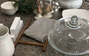
Hiding the Power Outlet
Along the counter, I keep things functional but pretty. I propped up a wicker tray against the backsplash, which complements the other décor on the counter.

But it also serves another purpose—hiding an unnecessary and quite ugly power outlet in the middle of the backsplash! I used Museum Wax to secure the tray in place to cover it up.

Styling the Other Counter Corner
In the other corner of the countertop, I like to prop up my favorite cookbooks, making them easily accessible when needed. Coincidentally, my recipe notebook, handed down by my mother, features all the fall colors found in the arrangement on the left side of the counter.

I added a large vase to act as a bookend, leaving it empty because it looks lovely just as it is.

Of course, I included a candle for a warm glow and an autumn scent.

The counter is stylishly decorated with complementary colors, yet there’s still plenty of space in the middle to display food when we have guests.

Styling Practical Counter Spaces
Let’s move to the counter space next to my stove, which needs to be practical, but I still want it to look nicely styled. Cutting boards, a mortar and pestle, and a spoon rest serve a utilitarian purpose, while the black vessel and plant add a bit of style.

To make it look more seasonal, I switched out the live plant for something more fall-appropriate. These stems, from Hobby Lobby’s floral department, reminded me of how vines start to dry out in fall. I put them in a pencil holder and added some black seed cluster clippings to complete the arrangement.

On the other side of the stove, I used a small tray as a backdrop and added a ceramic tray from Target in an earthy color.

I filled a black sugar container with Himalayan salt and placed a matching milk server next to it, filled with water—perfect for cooking!

A wooden bowl with fresh fruit finishes the corner.

Keeping the Kitchen Island Functional
Lastly, let’s address the kitchen island. Although I’d love to have a beautifully styled, large arrangement on the island, we use the surface multiple times a day to prep meals, so we need to keep it clear.

However, I still wanted to add a touch of fall décor. The next best thing? Use practical items to inject an autumn vibe! I switched out my dish soap dispenser for amber glass, brought in a short amber glass bud vase, and created a small arrangement with Hobby Lobby picks. It’s small, but it adds warmth to the area.

The Overall Look
And there you have it! Here’s the overall look of the dining and kitchen area. I hope I’ve inspired you with some simple yet effective styling ideas to bring a seasonal touch to your space.


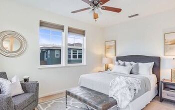
If you like what you see, stay tuned for my next video, where I’ll cozy up the main bedroom with fall-inspired elements—you won’t want to miss it! Thank you for watching, and I’ll see you next time. Bye for now!
For details of some of the products featured, check the video description box here.


Comments
Join the conversation