How to Create a Color Palette For Warm Minimalism

Today, we're going to talk about how to create a color palette for a warm minimalism interior using warm neutrals, earthy tones, and natural textures.
Minimalism doesn't have to be stark or cold. So, if a warm interior design while keeping with a minimalist approach is what you're looking for, read on.
Warm minimalism
How to create warmth
After my last warm minimalism video, I received a great question on which one or two colors can be used to create that warm vibe. That question is genuinely on the right track because part of creating a warm, relaxing space is making it feel harmonious.
One of the best ways to do this is to select colors and color families that are closely related but still provide enough nuance and color to keep the space from feeling bland.
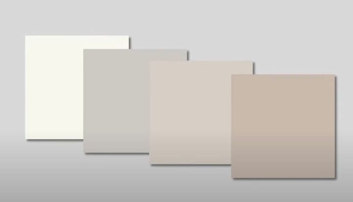
Neutrals like whites and grays, taupes, and tans are a great way to do this.
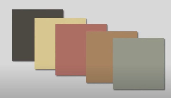
Pairing them with earthy colors like deep brown and muted yellows, reds, oranges, and greens brings in that warm and natural vibe.
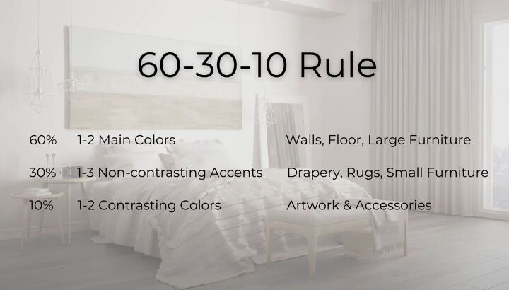
60-30-10 Rule
So, how do we go about selecting our main colors? Luckily, interior design provides us with a 60-30-10 rule, which is just a guideline and a jumping-off point for the selection of colors for your space.
Here are three examples of how it can work.
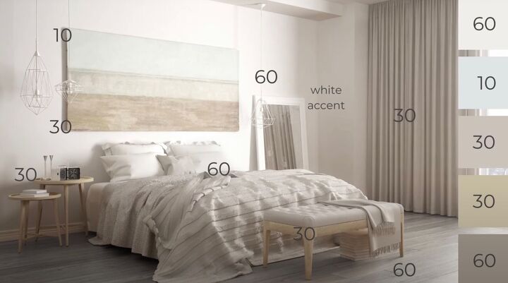
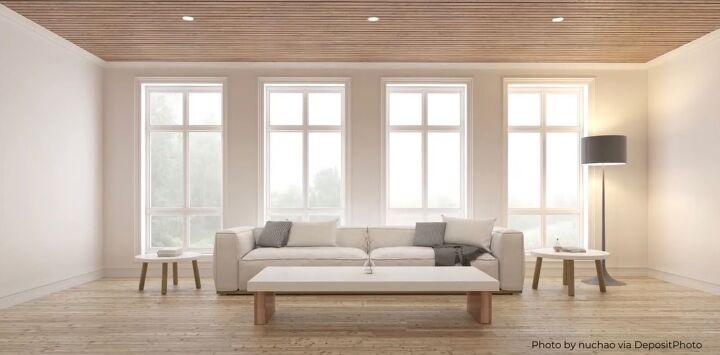
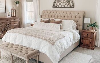
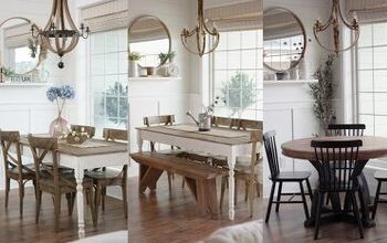
Neutral minimalist bedroom
Here's how it breaks down in this bedroom decorated primarily in soft neutrals.
60% of the room is in one or two main colors, and these are on your most extensive surfaces like floors, walls, and large furniture pieces like sofas, or, in this case, the bed or bedding.
30% of the room is in one to three subtle and non-contrasting colors that accentuate the main colors. This can be in the form of drapery, rugs, and small furniture pieces.
10% of the room is in contrasting accent colors in the form of lighting, artwork, pillows, and other accessories. In this case, the contrast is cool to warm in the form of the silver light fixtures and very light blue in the painting.
When designing with neutrals, adding accents of black or white can really help those neutral colors pop by creating contrast, like the white framed mirror pictured here. Another great way to do this is to introduce plants and greenery into your space. The green leaves will not only add coolness to a warm interior, but they will also bring in nature and add texture.
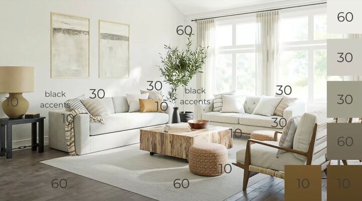
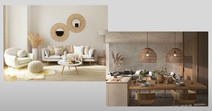
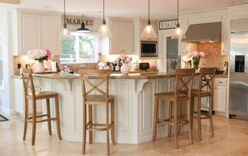
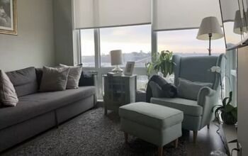
Warm minimalist living room
The living room pictured here uses light neutrals to create a warm and serene atmosphere. Color is introduced in wood tones and textiles in the yellow-to-orange color families and acts as the accent.
Think of items made of natural elements like wood, jute, metal, or clay as part of your color story.
In a very neutral interior, these are the items that add genuine interest. In this design, the black side table and plant also add a nice contrast to this all-neutral room.
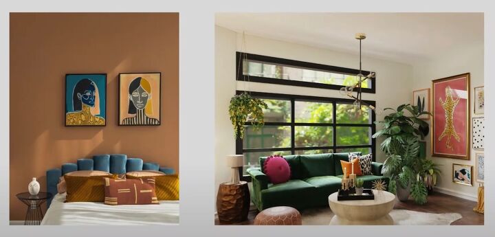
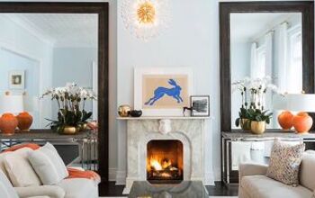
So far, the examples we've looked at have used only neutrals with hints of color, but what if you want to go bolder?

The following example uses a soft, medium orange tone for the sofa, which is a significant element.
Here, the 60% is split between the medium-neutral and the orange tone, and the lighter and darker neutrals provide harmonious accents.
The dark brown furniture pieces provide a 10% contrasting accent, and the design is further accented by a few black details in the plants.
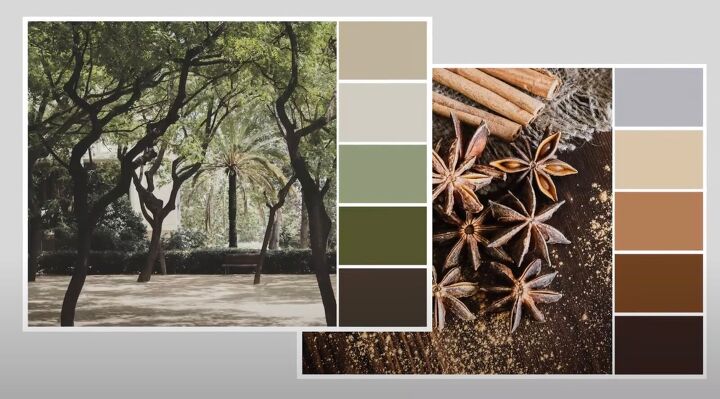
How to create an earthy feel
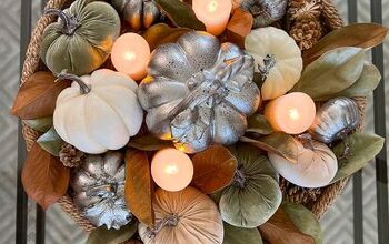
Some additional color palettes and tones you might want to consider to bring in an earthy feel are deep, muted greens and colors that remind us of fall, like yellow, orange, wine, and russet.
These can be used as a major part of the color scheme, like wall color or a large furniture piece, or as small as accent pillows in a very neutral scheme. Your imagination is the limit.
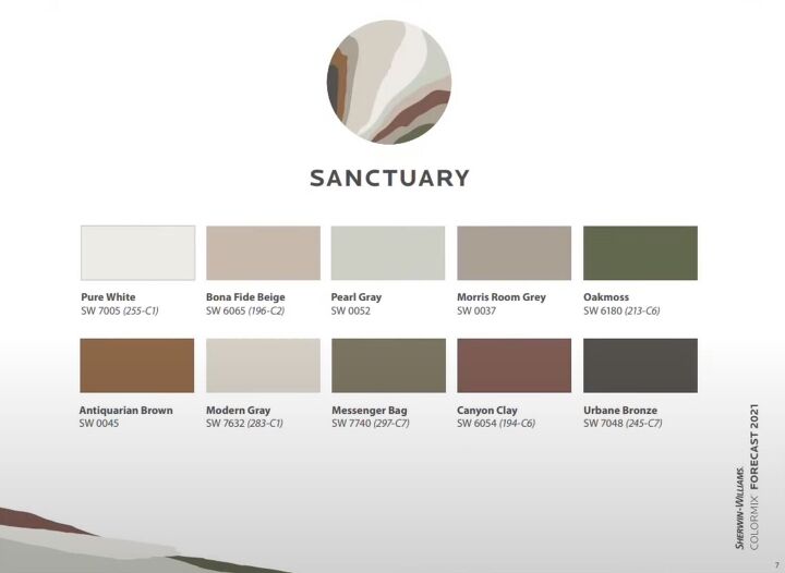
Warm and earthy palettes from Sherwin-Williams
Over the last several years, Sherwin-Williams has created warm and earthy palettes perfect for a warm minimalist interior, including the 2021 warm minimalist inspired palette Sanctuary and 2022's organic modern inspired Method palette.
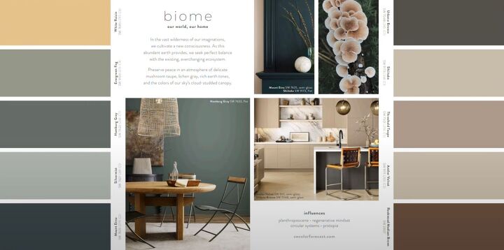
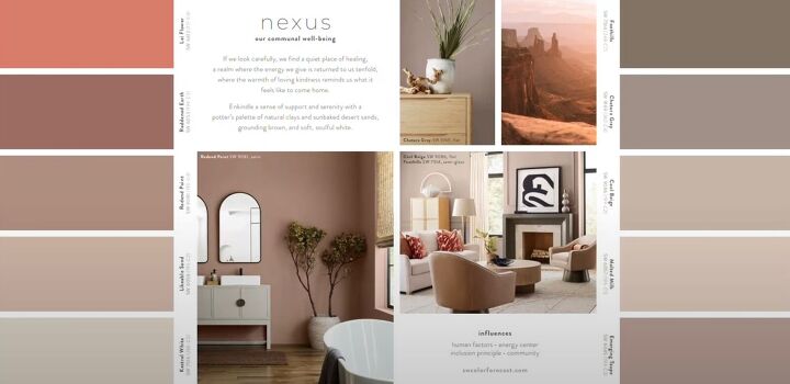
They've really outdone themselves with their recently released Biome and Nexus palettes, part of their 2023 color mix.
Both palettes include lots of great neutrals, with Biome leaning more toward forest tones while Nexus brings in more desert hues. Just keep in mind the feel you want for the space.
If the goal is to keep it calm and serene, then neutrals are a great way to go.
When you're using more saturated colors, bear in mind that hues opposite each other on the color wheel, blue and orange, yellow and violet, red and green, will create a more dramatic but less peaceful effect.
Design inspiration: Scandi & Japandi
A couple of design styles that can inspire warm minimalism are the Scandinavian and Japandi design styles.

Scandinavian design is a broad term for the design that comes from the Nordic countries of Denmark, Sweden, Norway, Finland, and Iceland.
All have produced and are still producing beautiful furniture designs and influencing interior design around the world, but only the countries of Denmark, Sweden, and Norway are actually in Scandinavia.
Warm minimalist
Thanks so much for being here, and I hope you enjoyed learning how to create a warm, minimalist interior. Remember, minimalism can be warm and inviting while maintaining minimalist principles.
I love reading your comments, so please leave me some comments below to share your ideas or projects.


Comments
Join the conversation