Sherwin-Williams’ Color of the Year 2025: Quietude HGSW6212

Every year, Sherwin-Williams unveils its Color of the Year, setting the tone for interior design trends and inspiring homeowners, designers, and architects alike.
For 2025, the color chosen is Quietude HGSW6212—a serene, calming shade that embodies tranquility and mindfulness.
As we move into a new year, Quietude offers a refreshing reminder to create spaces that nurture peace and balance. Here’s why Quietude is poised to become a favorite in homes across the globe.
Table of contents
Disclaimer: Redesign may receive a small affiliate commission from purchases made via links in this article but at no cost to you.
PRESTIGE Paints, Satin, Comparable Match of Sherwin Williams* Quietude*
A Soothing Escape in Color Form
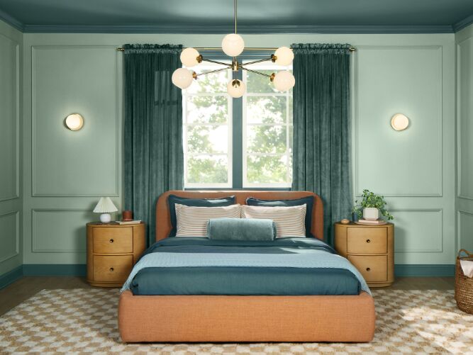
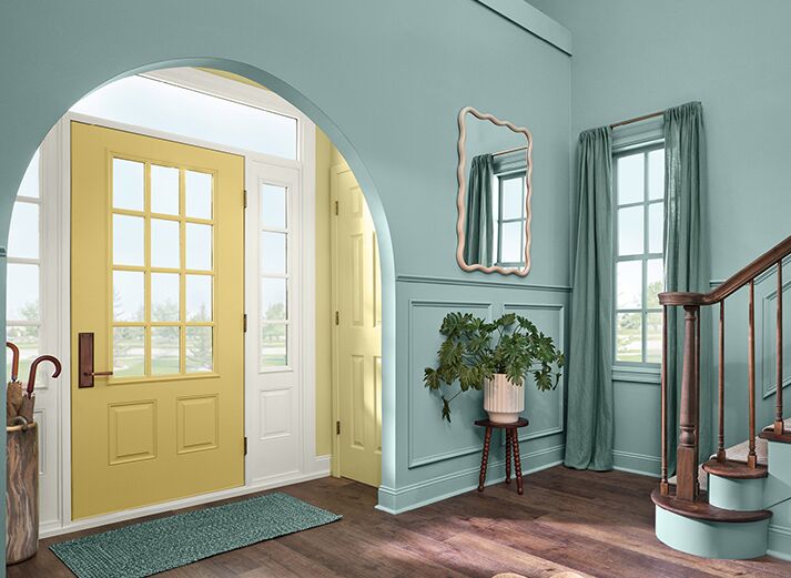
Quietude is a soft, muted green with blue undertones, reminiscent of a calm sea or the gentle shade of eucalyptus leaves. It’s a color that immediately evokes a sense of calm, making it an ideal choice for spaces where relaxation is key.
Whether used in a bedroom, living room, or bathroom, Quietude helps create an environment where one can unwind and recharge.
Peel-and-Stick Paint Sample - Quietude
In a world that often feels overwhelming, this shade acts as a visual retreat, offering a break from the chaos and a return to simplicity. Its understated elegance makes it versatile enough to be paired with a variety of design styles, from modern minimalism to cozy cottage chic.
The Psychology of Quietude
Color has a profound impact on our emotions and well-being, and Quietude is no exception. The green tones in this color are associated with growth, renewal, and balance, while the blue undertones bring feelings of calm and stability. Together, these hues create a space that feels both restorative and grounding.
Incorporating Quietude into your home can enhance your mental and emotional health, making it easier to relax after a long day or focus on tasks in a home office. It's a reminder to slow down, breathe, and find peace in the present moment—a concept that resonates deeply in today’s fast-paced world.
How to Use Quietude in Your Home
1. Living Room:
Quietude makes an excellent backdrop for a living room, especially when paired with natural materials like wood and stone. Consider using it on the walls to create a cozy, inviting space where family and friends can gather. Accentuate the color with warm neutrals, like beige or soft gray, and add texture with fabrics like linen or wool.
2. Bedroom:
Transform your bedroom into a sanctuary by painting the walls in Quietude. The soothing color promotes restful sleep and creates a peaceful atmosphere. Pair it with crisp white bedding, natural wood furniture, and soft lighting to enhance the serene vibe.
3. Bathroom:
Quietude’s calming nature makes it a perfect choice for bathrooms. Use it to paint the walls or vanity for a spa-like feel. Complement the color with white or marble accents, and bring in touches of nature with plants or wooden accessories to complete the look.
4. Kitchen:
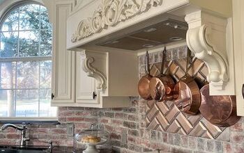
For a fresh, modern kitchen, consider Quietude for your cabinets or backsplash. The color pairs beautifully with white countertops and stainless steel appliances. Add brass or copper fixtures to bring warmth and sophistication to the space.
5. Home Office:
In a home office, Quietude can help create a focused and serene environment. Use it as the main wall color or as an accent wall to bring a sense of calm to your workspace. Pair it with natural wood furniture and plenty of greenery to enhance productivity and well-being.
Pairing Quietude with Other Colors
Quietude’s versatility allows it to be paired with a wide range of colors, depending on the mood you want to create:
- Neutrals: For a soft, cohesive look, pair Quietude with warm neutrals like beige, taupe, or creamy whites. This combination creates a timeless and elegant space that feels effortlessly chic.
- Earth Tones: Combine Quietude with earth tones like terracotta, deep browns, or mustard yellow to add warmth and depth. This palette is perfect for creating a cozy, grounded environment.
- Blues and Greens: Enhance the tranquil vibe by pairing Quietude with other soft blues or greens. This creates a monochromatic look that is soothing and harmonious.
- Metallics: Add a touch of glamour by incorporating metallic accents in gold, brass, or copper. These elements contrast beautifully with Quietude’s softness, creating a sophisticated and balanced space.
Touches of Quietude
What I love about this color is that it pairs well with cool and warm tones, so it's quite easy to throw a few subtle nods to the shade in your home decor. Here are just a few ideas I found on Amazon:
Bedsure Sage Green Fleece Blanket for Couch
Jewelry Dish Tray, Ring Dish
18pcs Eucalyptus Stems
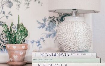
Battery Operated Table Cordless Lamps for Home Decor
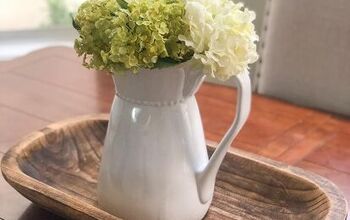
Handmade Wooden Decorative Tray
Final Thoughts
Sherwin-Williams’ Color of the Year for 2025, Quietude HGSW6212, is more than just a color—it’s an invitation to create spaces that promote peace, mindfulness, and well-being.
Whether you’re planning a full home makeover or just looking to refresh a single room, Quietude is a versatile choice that will continue to bring joy and serenity to your home for years to come.
So, why not start the new year with a fresh coat of Quietude and let the calming vibes transform your space?Let me know what you think of Quietude in the comments.











Comments
Join the conversation