Struggling With Color Combinations? Here's How to Create a Palette

Are you trying to create an aesthetic color palette in your space but struggling with how to combine different colors? Will blue and pink work? How about gray with hints of red?
Combining colors to create a cohesive look can be tricky, but it doesn't have to be a disaster. In this article, we'll be sharing the best tips that interior designers, experts, and color theorists use to create stunning color schemes for any space.
Table of contents
The Color Wheel

Our main guide when it comes to color combinations is the color wheel.
Primary colors
This wheel is made up of a variety of colors, with the first ones being the primary colors: red, blue, and yellow.

These primary colors cannot be created by mixing any other two colors.
Secondary colors
Next, we have the secondary colors, created by mixing two primary colors.

For example, mixing blue and red gives you purple, blue and yellow gives you green, and red and yellow give you orange.
Tertiary colors
There are still a few spots to fill on the color wheel, so after the primary and secondary colors, we have the tertiary colors.

These are simply created by mixing a secondary color with a primary color.
Cool and warm colors
The color wheel also has cool colors (ranging from green, blues, and purples) and warm colors (ranging from yellows, reds, and oranges).

Warm colors are vivid and energetic, while cool colors create a calming impression.
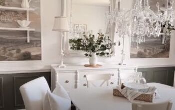
Neutral colors
There are also neutral colors: white, black, and gray.

Tints, shades, and tones
These are important for creating tints, shades, and tones of the various colors on the color wheel.

Adding white to a hue creates tints, adding black creates shades, and adding gray creates tones.
Now that we understand color theory, let's explore some color schemes to create your dream space:
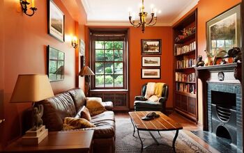
1. Monochromatic

This scheme uses a single color hue for the room with different shades, tints, and tones.


It's an easy way to create a bold and dramatic look while remaining elegant.

2. Complimentary

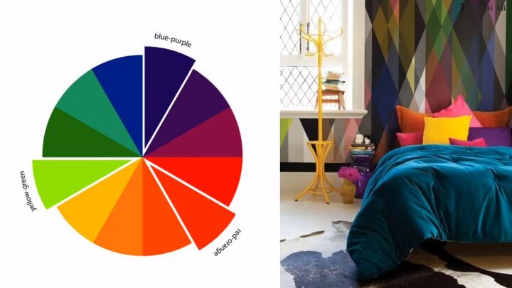
This scheme uses two colors opposite each other on the color wheel, like green and red or blue and orange.


Be mindful, as this bold approach requires careful balancing to avoid overwhelming the space.

3. Analogous
This scheme uses colors that lie next to each other on the color wheel, creating serene and comfortable designs.


This color combination is often found in nature.

4. Triad
This scheme uses colors evenly spaced around the color wheel, forming a triangle.


Triadic color harmonies can be vibrant even with pale or unsaturated hues.

5. Tetrad or Rectangle
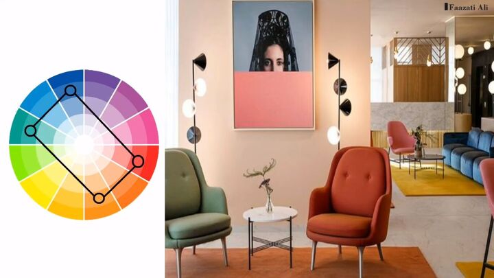
This scheme uses four colors arranged into two complimentary pairs.


It offers plenty of variation, but ensure one color dominates and there's a balance between warm and cool colors.

6. Square

This scheme is similar to the rectangle but with all four colors spaced evenly around the color circle.


Again, ensure color dominance and balance between warm and cool tones.

7. Split Complementary
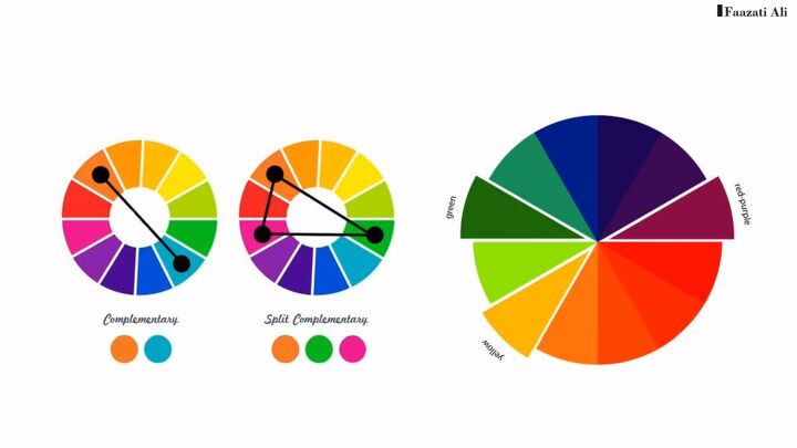
This variation of the complementary scheme uses the base color and two colors adjacent to its complement.


It offers strong visual contrast with less tension.

Neutral Colors: Your Foundation
Remember, always use neutral colors as your base and have the other colors as accents in your space. This will allow you to create a cohesive look without overwhelming the room with bold colors.
Conclusion
With these tips and a little practice, you can develop your eye for color combinations and create an aesthetic color palette for your dream space. So, unleash your inner designer and have fun!


Comments
Join the conversation