My Favorite Sherwin-Williams Paint Colors + Paint Tips & Tricks

Learning how to choose paint colors can be difficult and frustrating. I’m sharing my favorite Sherwin-Williams paint colors to help you choose. First, some important painting tips:
Table of contents

1. White paper test
Hold up a sample chip to a piece of plain white paper. You’ll then see the intensity of the sample chip and just how white it really is.

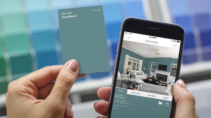


2. Use Sherwin-Williams’ ColorSnap
Use the Sherwin-Williams’ ColorSnap Visualizer program on their website. Type in the color and room you’d like to see it in and it pops the color in. There’s also a function that lets you see what the color will look like in the daytime and the nighttime.
3. Storing your paint
When you finish painting a room and you have a little bit of paint left in that big gallon can, buy an empty quart-sized can for the leftover paint. Or, you can buy empty 2-ounce bottles from craft stores to store touch-up paint. Use a blow dryer to remove the original paint label from the can and reapply it to the new container.
4. Keep paint from drying out
Before you put the lid back on your big can, put some plastic wrap over the top of the paint can. Then pop the lid on the can.
5. Touch-up paint
Water down touch-up paint so it does not look too fresh and new or it will stand out from a wall with older paint on it. Watering it down helps the paint to better feather and blend in with the old paint. If you originally used a roller to paint the wall, use a roller to add the touch-up paint. If you used a brush to paint the wall, brush on the touch-up paint.
6. Know where to use which sheen
- High gloss works well on trim and molding.
- Semi-gloss is a little less shiny and also works on trim and molding.
- Satin for the bathroom, laundry room, and kitchen wall was cleaned up well.
- Eggshell is my favorite for walls since it’s not too shiny and cleans well.
- Flat paint, in my opinion, should only go on the ceiling since it can be marked easily.
7. Use Samplize
Get a 12-inch by 12-inch sample of any paint for about $5.99. The sample sticks to your wall and you can easily move it around the room.


8. Know what LRV means
Look for the letters LRV on a paint sample. This stands for light reflective value. LRV goes from 0 to 100. The lower the number, the less light is going to be reflected. The higher the number, the more light the paint will reflect in a room.
9. Pay attention to popular colors
Pay attention to popular colors that bloggers and vloggers talk about–they are popular because they have worked for many people.

My favorite Sherwin-Williams colors
Whites
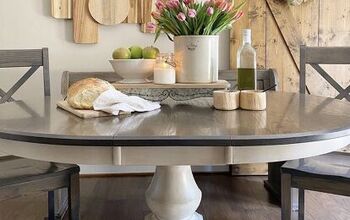
White is tricky. When we moved into our house, we knew we wanted to paint it white so I came home with 10 different whites and tested them all until we hit the right one. Most people want to know the best white for trim.
Whites will be either cool or warm. Before choosing, you need to know what color you’re painting the walls. Alabaster on the left is warm white and Snowbound on the right is cooler.

Here, the room colors are placed up against the trim colors. There’s Stardew (left, cooler) and Oyster Bay (right, warmer) so it is paired with Alabaster for the trim. Stardew is cooler and should be paired with Snowbound for the trim. The pairing will make the combination perfect.


Greens
Sea Salt is a lighter green with a coastal vibe.

Oyster Bay is not as light.

Acacia Haze is a medium green.

Retreat is a darker green. When I choose darker colors, I like muted colors because they have a little gray in them.

Blues
Stardew (light).


Krypton (light). Here is Krypton used in a kitchen.

Rain (medium)

Storm Cloud (medium)

Indigo Batik (dark). Here’s Indigo Batik in a bathroom being remodeled.

Distance (dark)

Gale Force (dark)

Grays
Light French Gray is a very popular light gray for a bedroom since it’s airy.


Here’s Repose Gray in a kitchen and a living room. The Repose Gray used in the living room is lightened by 50 percent. Lighten a color you love if you want to use it in a room with few windows.

Here’s Mindful Gray on the exterior of a home. It is so warm and inviting.


This is Nebulous White on a board and batten interior wall. Here it is also on kitchen cabinets and walls.

Greiges
- Mindful Gray
- Worldly Gray
- Agreeable Gray

Neutrals
Natural Tan did not make this living room look dark though there is not a lot of natural light coming in.

- Accessible Beige
- Neutral Ground
- Urban Putty
Urban Putty is a little darker and looks great on kitchen cabinets, too.
Blacks
Don’t get intimidated by black. It can make a room look so rich even if it’s used only on one accent wall.

Peppercorn is really a very, very dark gray. Here it is used in an office on a focal wall. Once we put the artwork up, it was amazing.


Here is Tricorn Black on French doors.

Here is Iron Ore in a bedroom.
Sherwin-Williams paint colors
I hope this helped you learn more about how to choose paint colors for your home interior. Sherwin-Williams has some beautiful colors to work with. Let me know in the comments if you’ve used any of them or your favorite Sherwin-Williams colors!


Comments
Join the conversation