6 Home Decor Color Trends For 2024
I always look forward to the Color of the Year announcements, especially from Pantone.
Not only do these colors showcase the latest trends in interior design, but they also make me reflect on the past year, what I want from the coming year, and why we are collectively drawn to certain colors at certain times.
Some of the colors are selected because of the calm and comfort the shade provides for a space, while others are bold and full of energy and optimism. Here are Color of the Year selections from six brands, what they signify, and how you can use them in your home:
Table of contents


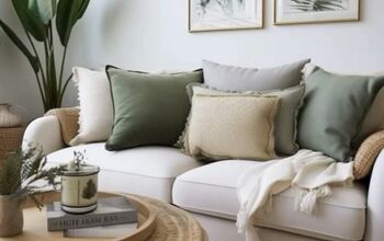
1. Peach Fuzz by Pantone
Pantone’s announcement of Color of the Year has become an event in itself, with a countdown that keeps people guessing as to what hue the color experts have picked to represent the coming year.

For 2024, Pantone has chosen Peach Fuzz for its radiance, youthfulness, warmth, comfort, and all-around “fuzzy feeling.”

A soft and cozy embrace, Peach Fuzz is welcoming and works as an overall color for a room or as an accent.

If you’re looking for specific ways to incorporate Peach Fuzz into your home decor, this year, Pantone has also teamed up with Ruggable and Spoonflower to create rugs, wallpaper, fabric, and more using the 2024 Color of the Year.
Pantone Peach Fuzz Neutral Grid Play Rug

AURORA VINE DAWN - Peach Fuzz - Pantone Color of the Year 2024 Wallpaper by holli_zollinger


2. Sweet Embrace by Dulux
The Dulux Color of the Year for 2024 is Sweet Embrace, a calming gray shade said to be inspired by “the softness of feathers and evening clouds.”

Peaceful Sweet Embrace is also versatile, lending itself well to a minimalist, neutral space or as a base for a pop of color; cool and tranquil palettes as well as warm and cozy color stories.

As a neutral, Sweet Embrace works well in most rooms, but I believe one of the best spaces to use it in is a bedroom. Seeing this color on the walls makes me feel instantly peaceful; perfect for a good night’s sleep.


3. Upward by Sherwin-Williams
For 2024, Sherwin-Williams has chosen to focus on a shade that signifies positive energy, sunny days, and blue skies. Upward is a light and breezy blue that is at once a breath of fresh air and a relaxing respite from the busy, modern-day world.

Upward combines well with darker blues, whites, and warm browns, creating a carefree, almost-coastal vibe.

I love how Upward brightens a living space, especially with the accent colors of white and sand, against textured throw blankets and pillows. This aesthetic transports me to the beach and who doesn’t want to feel like they live next to the ocean?
HGTV HOME® by Sherwin-Williams in Upward


4. Blue Nova by Benjamin Moore
Speaking of blues, Benjamin Moore selected Blue Nova as their Color of the Year for 2024. However, Blue Nova is more of a mid-tone, lying between blue and violet, said to evoke depth, intrigue, and allure.
The full Benjamin Moore color palette was inspired by the colors of travel:

These can combine to create spaces that are at once boundless and full of personality, while also offering comfort.

I would use Blue Nova on an accent wall. I think it would look great as the base for a gallery wall of wood or gold frames in a living space, study, or home office. It inspires creativity.


5. Behr - Cracked Pepper
Behr’s Color of the Year is Cracked Pepper, a soft black that is all about elevation. Sophisticated and dramatic, Cracked Pepper works for an accent wall, doors, cabinets, exteriors, as well as a full room.

This bold shade makes a statement and works best when paired with warm woods and accents of gold. Yet, Cracked Pepper is also a dark neutral and can be used to enhance the main focal points of a space.

I love how Cracked Pepper looks in the dining room, especially with minimalist furniture in light, natural wood tones. As Behr describes, walls in this shade help draw your senses to other elements in the room, such as furniture pieces, but that’s also true of a great meal or beautiful tablescape, which should always be the main focus in a dining space.
Behr Cracked Pepper at Home Depot


6. Coloro + WGSN - Apricot Crush
Finally, WGSN and Coloro have joined forces for their Color of the Year, which is Apricot Crush. WGSN, a global trend forecasting agency, predicts that Apricot Crush will be present not only in interior design but also in fashion, marketing, cosmetics, and more.

Warm, vibrant, and exciting, this hue has abundant impact and energy. Joy, creativity, and optimism are all words associated with Apricot Crush, which conjures images of bountiful harvests and sun-kissed fruits.
As with the image above, I think something as bright and bold as Apricot Crush is best incorporated as a pop of color; in throw pillows, light fixtures, or a standalone statement chair.
Colors of the Year for 2024
The Colors of the Year always inspire me to rethink and refresh my home for the new year, whether that means actually repainting or simply shaking things up a little with new decor.
Which of these six colors would you use in your home and where? Let us know in the comments below.


Comments
Join the conversation