10 Common Design Mistakes People Make When Choosing & Displaying Art

When it comes to decorating a home, the way art is chosen and displayed can make or break a room's overall aesthetic. I find this so difficult because art is subjective. However, just because a piece of art speaks to you doesn't mean it goes well in a room or even belongs in your home at all!
In this video, interior designer Rebecca Robeson shares 10 common mistakes that people often make when selecting and positioning art in their living spaces. I found her advice so helpful and I hope you do too.
Here's the full video, including case study examples, as well as a summary of the main points below:
Table of contents
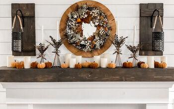
1. Overcrowding the Walls
Many people believe that every inch of wall space must be filled with art, leading to visual clutter. It's essential to allow some breathing room on the walls, as empty space can help highlight the art you do choose to display.

2. Improper Art Placement
Placing art too high or too low is a frequent mistake. Art should generally be hung at eye level. For most people, this means the center of the artwork should be about 57 to 60 inches from the floor.
3. Inconsistent Groupings
Grouping different pieces of art together can create a cohesive look, but inconsistency in frames, styles, or themes can disrupt harmony. It's important to ensure that grouped art pieces complement each other in some way, whether through color, style, or subject matter.

4. Ignoring Scale and Proportion
Art that is too large or too small for the space it's in can throw off the balance of a room. For example, a tiny piece of art above a large sofa will look out of place, while an oversized piece on a small wall can overwhelm the space.
5. Mismatched Frames
Using frames that clash with the art or the room’s decor is a common misstep. Frames should enhance the artwork and coordinate with the room's design elements. This doesn't mean all frames need to match, but they should feel intentional and cohesive.

6. Neglecting Wall Height and Width
Art that extends too far to the edges of a wall, or that doesn't take advantage of the wall’s height, can make a room feel unbalanced. It's crucial to leave enough space around the art for it to stand out without appearing cramped.
7. Overuse of Mirrors
While mirrors can be a great design element, using too many or placing them haphazardly can create a chaotic look. Mirrors should be used strategically to reflect light and enhance the space, not overwhelm it.

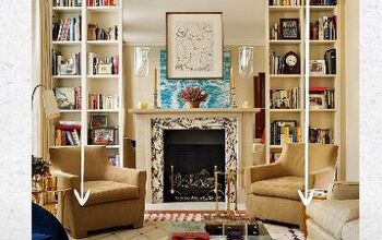
8. Competing Focal Points
When art competes with other focal points in the room, like a fireplace or a large window, it can detract from the overall design. It's important to consider the room's layout and choose art that complements, rather than competes with, the main features.
9. Neglecting Personal Touch
While it's tempting to follow trends, art should also reflect personal taste and style. A room filled with trendy art that doesn't resonate with the homeowner can feel impersonal and out of place.

10. Poorly Lit Art
Even the most beautiful piece of art can go unnoticed if it isn't properly lit. Whether through natural light or strategically placed lamps, ensuring your art is well-lit will enhance its impact and draw attention to it.
By avoiding these common mistakes, you can ensure that your art enhances your space rather than detracts from it.
How do you choose what art to display in your home and where to put it? Let me know in the comments below.


Comments
Join the conversation