Building a Home of Substance: Our Journey Beyond Glamour and Trends

What truly makes a home? Is it the luxurious finishes and extravagant details, or is it something more fundamental?
Architect Karen Alcock was determined to create a house that demonstrated you don’t need glamorous finishes to have a lovely home. Instead, what you need are smart design choices, the right team, and strategic investment.
Here’s a tour of her family home in Northcote:


Our interest was sparked by visiting iconic modern houses that emphasized new ways of living rather than showcasing flashy finishes. These houses were built simply, but effectively, which led us to explore what a new way of living could look like for us.


The site we chose comprises two lots, totaling 380 square meters, though 160 square meters of that is an easement running down the side and through to the rear. We didn’t let the easement concern us; instead, we saw it as an opportunity to create a fantastic garden.

The original house on the site was an old weatherboard structure that, while charming from the front, was quite disappointing inside. The floor was rotting, and there was a hole in the bathroom floor.


We wanted to identify the critical elements that would enhance the house. We concluded that the building itself was almost the least important part of the equation.

The garden, on the other hand, was crucial.

We aimed to build a house that was technically advanced in a straightforward manner, incorporating features like solar panels and heat pumps that add long-term value.


In our quest, we also looked at friends' homes that weren’t architecturally designed, observing the materials they used and what brought them joy. These weren’t necessarily the elements architects might celebrate.


This led us to experiment with using builder-grade materials rather than high-end architect-grade materials. We were curious to see what kind of quality house we could create with off-the-shelf items, celebrating good trades and maintaining simplicity.


Our approach involved adding a few luxury items on top of a simple base.


The design was divided into three parts, effectively creating three separate small dwellings under one roof. This layout accommodated our needs for aging-in-place parents and a son.


The front half of the house includes a guest wing and my study, which can also double as a sitting room for long-term guests.


The main door leads to our living room, which is the most generous space in the house, encompassing the kitchen and dining area. Jojo’s and my bedroom, along with an en suite, are situated here, while Luca’s bedroom, bathroom, and sitting room are located at the rear.

We even considered adding a door to Luca’s corridor in the future to give him complete independence and a separate entrance.

The house is designed on a rigorous 3.8-meter grid, ensuring that all windows are uniform in size, except for the one at the back.


This grid system created an orderly and cohesive feel. For example, the living room features three windows, each designated for a specific use: one for the sitting area, one for the dining area, and one for the kitchen.


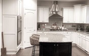
We wanted the kitchen to be a standout feature, so when Luca requested an electric kitchen, we explored various options and ended up incorporating an induction oven and a Sub-Zero fridge into our budget.

Designing the kitchen around the fridge made everything feel cohesive, and the addition of a breakfast bar with fold-back doors has been a real bonus, allowing us to keep the space tidy and organized.

Amanda Oliver, who did our garden, was instrumental in bringing our vision to life. We wanted the garden completed early, and Amanda’s ability to layer planting seasonally created a constantly surprising and beautiful environment.

Some plants we initially questioned ended up becoming the most stunning features. Despite my initial reluctance about including grasses, Amanda’s choices proved to be excellent, and the garden has become a significant part of our well-being.


The outdoor bath, or onsen, was another feature we included. Though we use it only once or twice a month, it is cleverly hidden behind plants, maintaining the garden’s clean lines.

In terms of the building itself, we kept things simple with corrugated iron, master board, and straightforward windows. We focused on the tactile moments—the things you touch and interact with.


For instance, we designed the sliding door handles to mimic the shape of a calculator, adding a unique touch to an otherwise simple door.


Inspired by my travels in Italy, particularly in Venice and Milan, we incorporated a marble detail on the window reveals, paying homage to the elegant simplicity of those experiences.

Ultimately, our goal was to create a home where the elements that make it special are not just the design features but also the personal touches and memories we add over time. We wanted to celebrate those things that mean something to us, even if they might not be significant to others.
Jojo and I worked closely together on this project, and the most exciting aspect is that we both love the house. It’s a reflection of our tastes and needs, and while we appreciate that it might not be everyone’s cup of tea, we are genuinely happy with it. It has transformed our lives, providing a space where we can relax and enjoy the garden. We feel incredibly fortunate and privileged to call this place our home.


Comments
Join the conversation