Ditch the White Trim: Embrace Bold & Beautiful Baseboard & Trim Colors

For years, white trim has been the go-to choice for homeowners and designers alike. It’s clean, classic, and versatile, which makes it a safe bet. But as interior design trends evolve, so does the desire for something fresh and unexpected.
If you’re ready to shake things up and add a unique touch to your home, it’s time to ditch the white trim and explore the world of colorful baseboards and trim. Here’s how to do it.
Table of contents
Disclaimer: Redesign may receive a small affiliate commission from purchases made via links in this article but at no cost to you.
Why Go Beyond White?
Before diving into specific colors, let’s explore why you might want to consider moving away from white trim:
- Adds Character and Depth: Colored trim can add an extra layer of personality to a room. It highlights architectural details that might otherwise blend into the background.
- Enhances the Overall Color Scheme: Choosing a trim color that complements or contrasts with your wall color can tie the entire room together, creating a cohesive and polished look.
- Creates Visual Interest: With white trim, there’s often little contrast between the walls and the trim. A different color choice can make your trim stand out, adding a subtle yet striking design element.
- A Break from Tradition: If you’re tired of the same old look, switching up your trim color is an easy way to modernize your space without a full renovation.
Now that you’re convinced it’s time to ditch the white trim, here are some bold and beautiful colors to consider for your baseboards and trim:

1. Charcoal Gray
Charcoal gray is a sophisticated choice that works particularly well in modern and industrial spaces. It adds a sleek, dramatic edge to a room, especially when paired with lighter wall colors like soft grays, whites, or even pastels. Charcoal trim can also be a great way to introduce depth in a room without overwhelming the space.
ALL-IN-ONE Paint, Weathervane (Charcoal)

Rust-Oleum 372010 Transformations Basics Cabinet & Trim Paint

Dark Grays

2. Navy Blue
Navy blue trim is a bold choice that can elevate any room, making it feel more luxurious and refined. It pairs beautifully with both light and dark walls and is especially stunning in spaces where you want to create a classic, timeless look. Navy trim works well with a variety of styles, from traditional to coastal.


Satin Nantucket Navy Rust-Oleum Advanced Dry Door & Trim Paint

Rust-Oleum 331051 Milk Paint Finish, Quart, Navy, 32 Fl Oz (Pack of 1)

Hale Navy HC-154 by Benjamin Moore

3. Earthy Greens
Greens, ranging from olive to sage, are having a moment in interior design. An earthy green trim can bring the outdoors in, offering a calming and grounding effect. This color is particularly effective in rooms with natural elements like wood and stone. It’s perfect for creating a serene, nature-inspired retreat.


Globalcom Acrylic Wood Paint

ALL-IN-ONE Paint, Crete Olive Green

Clary Sage 6178 by Sherwin-Williams

4. Rich Burgundy
Burgundy trim adds a sense of warmth and richness to a space, making it ideal for dining rooms, libraries, or any area where you want to create a cozy, inviting atmosphere. This deep, luxurious color pairs well with neutral walls or even dark, moody hues for a more dramatic effect.


Rust-Oleum Advanced Dry Door & Trim Paint Satin Cranberry

PRESTIGE Paints Exterior Paint and Primer In One Burgundy

Classic Burgundy HC-182 by Benjamin Moore

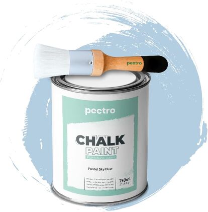
5. Soft Pastels
If you’re not ready to go too bold, consider soft pastel trims like blush pink, powder blue, or mint green. These colors can add a playful and whimsical touch to a room without overwhelming it. Pastel trims work well in nurseries, bedrooms, or any space where you want a gentle, calming vibe.

Chalk Paint for Furniture Sky Blue
PRESTIGE Interior Paint and Primer in One, Mint Frost, Semi-Gloss

Soft Sky 807 by Benjamin Moore

6. Black
Black trim might seem like a daring choice, but it’s incredibly versatile and chic. It adds instant drama and contrast, especially when paired with lighter walls. Black trim is perfect for creating a modern, minimalist look, but it can also work in more traditional settings when combined with rich, bold wall colors.

Rust-Oleum 369383 Advanced Dry Door & Trim Paint, Quart, Satin Black

THE ONE Paint & Primer Black, Matte

Darks

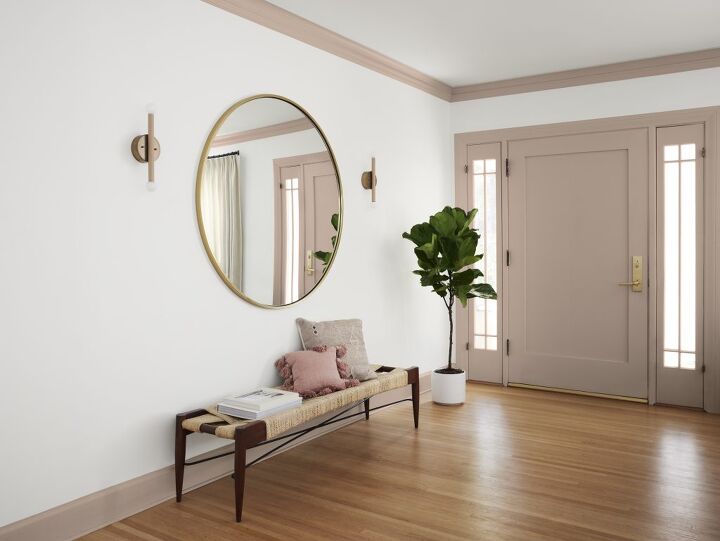
7. Warm Taupe
For those who prefer a neutral palette, warm taupe is a fantastic alternative to white trim. This color adds warmth and sophistication without stealing the spotlight. It’s subtle yet impactful, providing just the right amount of contrast against both light and dark walls.
Rust-Oleum Brush Painter's Touch Ultra-Cover Multi-Purpose Enamel Paint Gloss Almond

RECOLOR Eco-Friendly Exterior Premium Latex Paint for Walls, Siding and Trim Eggshell Finish

Light-Medium Taupes

8. Mustard Yellow
Mustard yellow is a bold and unexpected choice that can add a burst of energy and vibrancy to a room. It works particularly well in eclectic or mid-century modern spaces, where it can serve as a striking accent against more muted wall colors.

Rust-Oleum 334195 Milk Paint Finish, Quart, Venetian Yellow

Brown Mustard PPG1208-5 by PPG


Tips for Choosing the Right Trim Color
- Consider Your Wall Color: Your trim should either complement or contrast with your wall color. For a harmonious look, choose a trim color that’s a few shades darker or lighter than your walls. For a bolder statement, pick a color that contrasts with your wall color.
- Think About the Mood: The color you choose for your trim will influence the overall mood of the room. Soft pastels create a calming atmosphere, while dark colors like charcoal or navy add drama and sophistication.
- Test Before You Commit: Always test your chosen trim color on a small section before committing. Colors can look different in various lighting conditions, so make sure you’re happy with how the color looks throughout the day. You can use Samplize for stick-on samples.
- Don’t Be Afraid to Experiment: Choosing a non-white trim color is all about embracing your personal style. Don’t be afraid to experiment with different shades and see what resonates with you.
Conclusion
Ditching the white trim in favor of a more colorful option is a simple yet impactful way to refresh your home’s interior. Whether you choose a deep, dramatic hue like charcoal gray or a soft, soothing pastel, colored trim can add character, depth, and a unique touch to your space.
So, step outside the box, and let your trim be the unexpected star of your home’s design.
Would you try out any of these trim colors? Let us know in the comments below.


Comments
Join the conversation